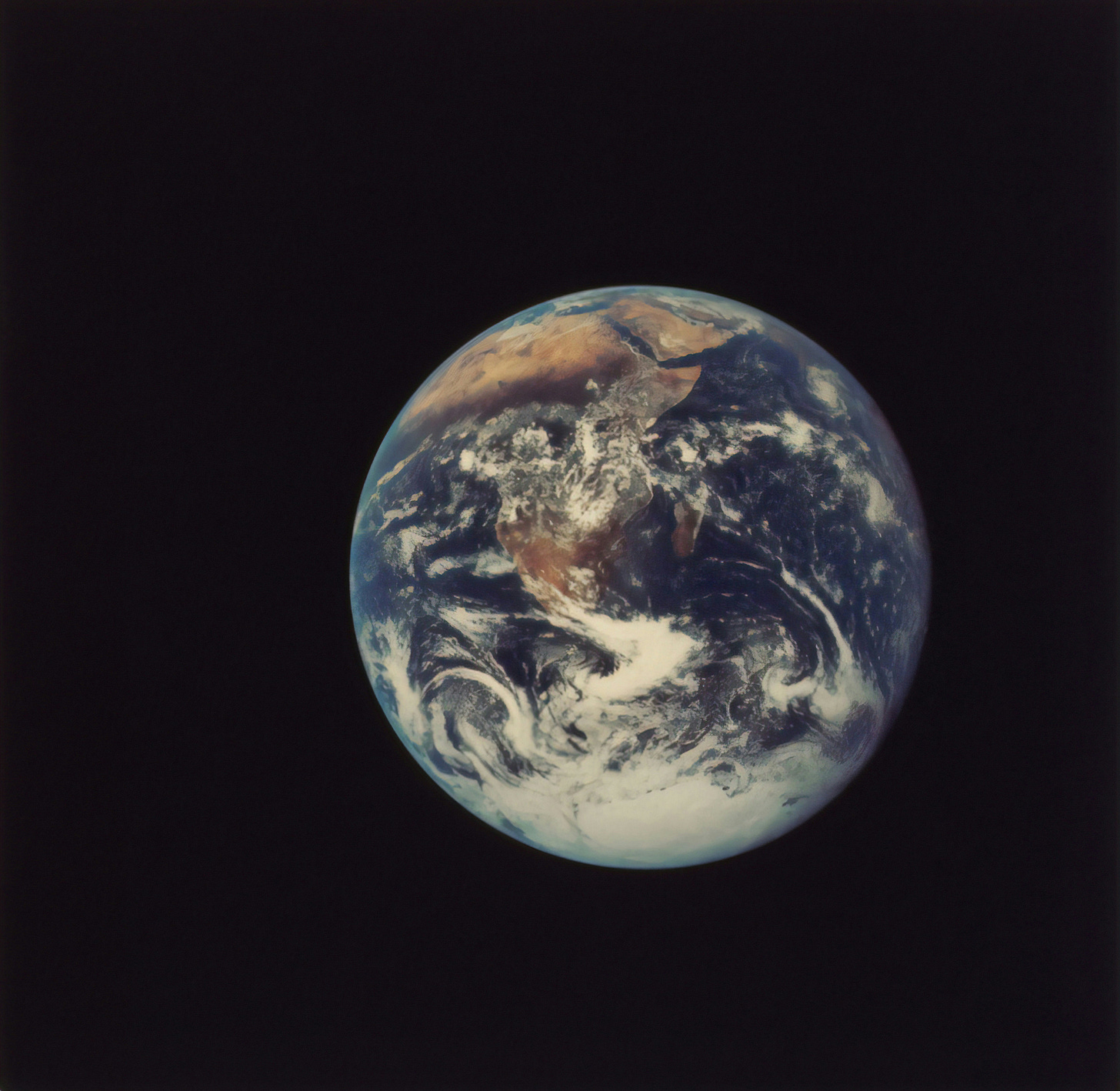
Why don’t we view the Earth flipped on its side?
...spinning like a rotisserie?

OK, stick with me here – I know the question for this week is a weird one. It stems from a link about maps that I happened upon a few weeks ago while researching How old is this river? along with a comment made by newsletter reader Matt on a recent hike. He revealed to me that the planet Uranus spins on its side due to some massive collision eons ago.
Maybe I’m the last to hear of Uranus’s odd spin (back when I built my 4th grade model of the solar system, Pluto was still a planet and the internet didn’t exist, so color me uninformed), but in case you didn’t know:

Most of the planets in our local neighborhood, it turns out, spin with a slight tilt like Earth. Uranus is the only exception for spinning (like a rotisserie) on its side. Each of the planets spin around an invisible axis in a counterclockwise rotation, all except for Uranus (again) and Venus, which spin clockwise. Again, their reverse spin is likely due to a large collision.
Why do all planets spin the same direction? Well, the sun also spins counterclockwise, so the entire system rotates around the sun in the same direction most likely due to its having originated from a giant gas cloud 4.5 billion years ago.
So, it makes some sense that, once we humans had enough technology to begin viewing the planets (thanks, Dutchman Hans Lippershey, for the telescope!), we envisioned our planet spinning like a top to match (most of) the other planets.
But there is no “up” in space. So, why isn’t Antarctica on top? Why is north always “up”?

In fact, our planet is spinning in wide open space and how we view it depends entirely on where we are in space. To space travelers, I’m sure Earth does appear to spin like a rotisserie if that’s how it’s oriented. But we definitely do prefer to view the Earth the same way, with Antarctica on the bottom and the bulk of the livable land above the equator. Why is this?
It didn’t always used to be this way. Even though we’ve been drawing maps for the past 14,000 years or so, we’ve only consistently put north at the top of our maps for the past few hundred years. Almost all ancient peoples oriented themselves east-west as the sun traveled. Egyptians, as sun worshippers, put east at the top of their maps since that’s where the sun god Ra appeared from each morning. Even the map that Christopher Columbus used was oriented with the east as “up.”
Islamic maps put south at the top, which then placed Mecca above most Islamic countries and forced the people to look up to it.

On the other hand, early Chinese maps always put north at the top because that’s where the Emperor lived, and it meant his subjects looked “up” to him, representing a position of subjugation.
Obviously, it was every culture for itself for ages until finally, in 1569, Gerardus Mercator created a map to aid sailors that took into account the curvature of the Earth. Previously, cartographers had pretty much ignored sailing charts, but Mercator combined the drawn maps of cartographers with data from Portuguese and Spanish sailors to create his "New and more complete representation of the terrestrial globe properly adapted for use in navigation."

Mercator’s map had a great deal of additional text, swinging wildly between impressive, It is here that the magnetic pole lies to Trip Advisor-y, At this place, on a mountain, are set two flute-players in bronze who probably were put here by the Tartars as an everlasting memorial of the attainment of their freedom, to mythical, Charybdis which every six hours engulfs the waters and then casts them forth with a terrible clamor.
What Mercator did extremely well, however, was correct a problem sailors had with flat maps — due to the curvature of the Earth, the shortest distance between two points is actually a curved path. Even planes today take a slightly curved path:
Mercator’s map made navigation easier to calculate.
However.
In order to create a flat representation of a spherical world, Mercator had to sacrifice something, and that was accuracy of the size of land masses. The farther away a country is from the equator, the more distorted its size. For instance, Russia is actually not AS big as it looks on most maps – don’t get me wrong, it’s still the largest country in the world. But maps do not accurately portray its true size:

This distortion is called Mercator’s Projection. Imagine taking a globe and sliding a large paper cylinder over it so that it surrounds the globe, and then projecting each country onto the paper cylinder. When you unrolled the cylinder, you’d have a rectangular map, but the landmasses at the top and bottom of the globe would be distorted due to their distance from the cylinder. This 40 second video is a great explanation:
A more thorough explanation can be found here.
All that to say, Mercator’s map solved some problems and created others. Over time, once Mercator’s map became widely used, all maps began to be oriented with north at the top.
However, there’s room to believe that the northern orientation of maps has contributed to a northern bias. In general, we tend to think of “up” as positive (it’s where the Gods live, the birds soar) and “down” as negative (where worms and the dead are buried). Up is also a symbol of power – queens sit on daises to proclaim decrees, and altars are positioned in high places. To paraphrase Gordon Gekko, UP is good.
Because of this, in today’s culture “north” on a map or in a city is oftentimes associated with nicer housing and more well-to-do people while southern areas are perceived to be poorer, cheaper and less desirable. In studies examining this north-south bias, when people are presented with maps that orient south at the top, the bias disappears.
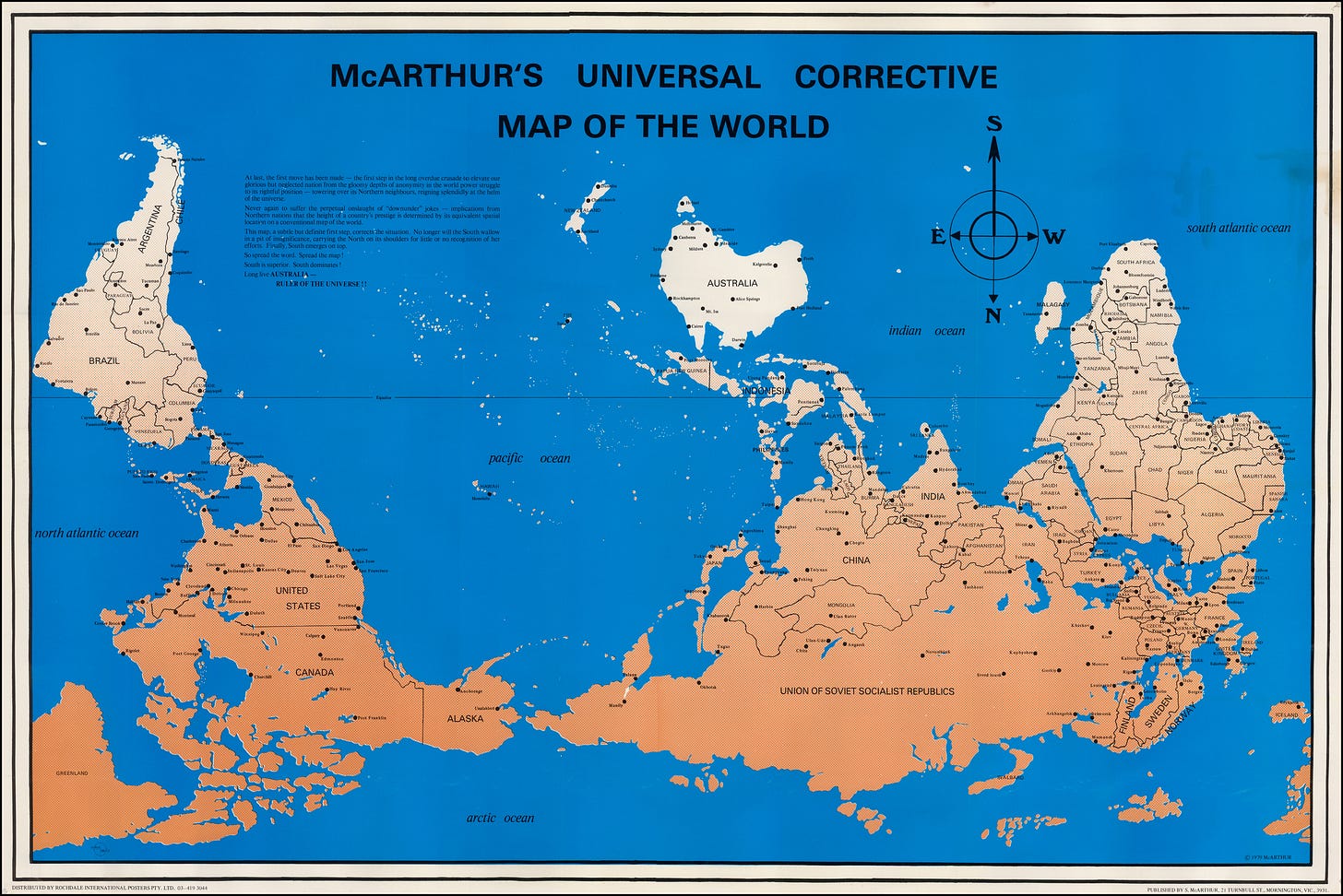
Which brings us to McArthur’s 1979 Corrective Map, an attempt to correct this bias by placing Australia on top of the world.

Disorienting, isn’t it? Another reason it’s a bit jarring – it centers the map on the Pacific Ocean, rather than the Atlantic. It also makes more obvious the fact that the bulk of the land mass of our planet is in one hemisphere – whether that’s the southern or northern depends on how you look at it…


Where I live (South Africa) we frequently experience Northern Hemisphere Bias. It’s just one of those things, like left-handed people (yip, that’s me again) know the meaning of those societal stereotypes that are everywhere.
A fun video on the same topic: https://youtu.be/B14Gtm2Z_70?si=lH4Q5BOQSl7Hdwu9